Flexed Info Boxes 2
Compatible with:
Blocks used:
- Info Box
- Row Layout
Live Demo:
Flexed info boxes
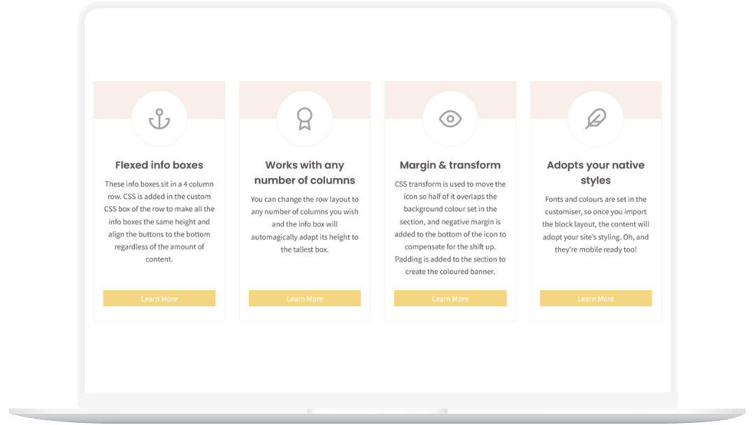
These info boxes sit in a 4 column row. CSS is added in the custom CSS box of the row to make all the info boxes the same height and align the buttons to the bottom regardless of the amount of content.
Works with any number of columns
You can change the row layout to any number of columns you wish and the info box will automagically adapt its height to the tallest box.
Margin & transform
CSS transform is used to move the icon so half of it overlaps the background colour set in the section, and negative margin is added to the bottom of the icon to compensate for the shift up. Padding is added to the section to create the coloured banner.
Adopts your native styles
Fonts and colours are set in the customiser, so once you import the block layout, the content will adopt your site’s styling. Oh, and they’re mobile ready too!
Note: This block has been updated, removing 99% of the CSS and relying on new Kadence features!